Journals, Blogs, and Art. Oh My.

Hello! Long time no see!

I’ve fallen off the blogging bandwagon as of late, and I found myself in a bit of a rut with the way I was doing things.

It was a busy time–I subbed for a coworker while she went on maternity leave, and I was working with a number of students who were busy with those mid-semester lulls and the typical issues they run into with their work. But I found myself not doing a whole lot beyond that.

When I got the breath of fresh air of no longer subbing, and getting down to gradebook zero on Progress Check day, I found myself excited to start busting through all those things I had on my to-do list: making demonstration videos for things that were tripping up photo students, and doing some in-depth checks on student progress so I could send them resources to help them along. These last couple of weeks have been a blizzard of google slides and spreadsheets and email templates as I worked through all those things that had been sort of looming over my head while I was just in the grading tunnel.

As I’ve been preparing the announcement slides for my visual art course, I’ve been focusing in on one aspect of their course: an Artist’s Journal. I’ve been sharing resources that I hope get them thinking about the ways they can use their art journal (or any journal) outside the assignments in our course, since it’s such a great art practice, and a therapeutic one as well.

Then, over the weekend I helped my parents work on setting up their newly finished basement. We found some boxes in storage that were from my old bedroom–lots of long-lost treasures, broken purses, lonely socks, and one box that had every journal I owned from age 7 to age 18. They were mostly composition books, some sketchbooks and some bound journals.

My whole life I’ve suffered from a pretty severe anxiety disorder. Throughout elementary school I had anxiety attacks, although I never knew what they were and didn’t complain about them because I didn’t realize they were out of the ordinary. I’d just get really tense, everything would seem very loud, and I’d be out of breath. It would last anywhere from ten minutes to, in rare cases, about an hour. I wouldn’t really be able to speak very clearly. I didn’t want anyone to notice, so I just stayed quiet.

In middle school, I started journaling, and my anxiety quieted right down. I journaled every single day, often during class when I should’ve been taking actual notes, all throughout middle and high school. I just wrote whatever I was thinking about. I wrote to do lists, I doodled, I taped in tickets and pictures, whatever I wanted. I ended up with what is now a pretty cringey narrative of my teenage years, with some incomplete algebra notes interrupted the flow of what was going on in band that year.

I stopped journaling in college: the price of taking actual notes was apparently that my therapy time was taking a backseat. It was then that my anxiety attacks, which I now understood them to be, returned and I was finally diagnosed and put on a medication for it. I say it like this happened quickly, but in reality my anxiety was very bad throughout most of college and student teaching (2011-2016) and in 2016 (that’s so recently!) I finally made the jump and got on medication. I recently lapsed about a week and a half due to some silliness with needing the prescription refilled, and it reminded me how thankful I am for those little white pills.

I noticed the correlation between my therapeutic journaling and my general quality of life, but I was so busy! I transferred to Michigan State my junior year, and I was taking about 17-20 credits a semester. I was supporting myself living in an apartment, which meant I was working at the library during the day and a coffee shop at night, and I was pulling all nighters in the painting studio. I knew I should take a step back and do something for myself, but I always wanted to check one more thing off the to do list first.

Self Care is a real buzzword right now. I know kids today are exposed to a much more positive dialogue on mental health, and I’m really excited to be sharing some ways that the things we do in our course can be a part of the things they do for themselves.

But it’s also reminding me that I’m not working two jobs and taking 17 credits anymore, and I should be doing a better job of practicing what I preach. I’m looking forward to using the modern equivalents of my middle-school-soap-opera-notebooks and blogging, journaling, and making art for myself. I know I feel better and I do better, both personally and professionally, when I’m doing something like this, and I’m throwing myself back into it.

Saying goodbye to some friends…

As this year wraps up, the course I’ve spent the lion’s share of my time working with, Digital Imaging & Communication, is being retired.

It’s a mixed bag: it’s time for this guy to go. The workshops have screenshots of old versions of GIMP, and it’s full of little issues. I’m really excited for the shiny new content that will be taking its place!

On the other hand, though, the older and clunkier a course is, the more help we need to give it as online instructors: meaning I have a TON of extra content created for this course that I don’t get to use anymore!

That being said, I think that these resources are still useful: they will just need a bit of a makeover.

Writing Constructive Feedback

Google Doc Link

This was a set of guidelines I set up when I introduced a Critique-style discussion board in the course. I was a little worried–after all, in a face to face environment a critique is easier to moderate. It happens in real time, and students know each other. Online, I was afraid that there could be issues with respect.

I created this document with suggestions about how to phrase things, and the expectations of any students participating in the discussion board. I never had any issues with student comments: I don’t know if this had anything to do with that, but I still think it’s a useful resource for any introduction to an art critique environment!

GIMP Program-specific Tutorials

The course was taught in GIMP, and was filled with workshops that used screen captures of an older version of the software: some of the icons and setup of the program had changed, which led to confusion for students who were still trying to learn their way around.

For the earlier assignments, I created some detailed step-by-steps for navigating the program.

I’m sure it won’t be long before these are also outdated, but for anyone working in GIMP 2 (specifically 2.8) these will be current.

Working with Layers Google Doc

Tracing an Object Walkthrough 

–> this is specific to a project from the course (the “Beautiful Building” assignment) but contains instructions for taking a photograph, creating a separate layer on top of the original photo, and tracing it. It includes the straight line shortcut.

Color Picker Chrome Add-on

Google Doc Link

This was a cool tool I came across in the chrome store and created a tutorial for: it allows you to pluck a color’s HTML code right off of anything you’re viewing in chrome, so you can use that exact color in GIMP or any other imaging software.

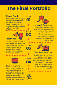
The Final Portfolio

This was a very student-led part of the course–it’s applicable to any Digital Art course. The course I taught was very broad in scope: graphic design, photo editing, and illustration were all covered, so the portfolio was open to any kind of digital work students were interested in creating.

With any assignment that broad, students needed some direction when it came to choosing the path they’d take for their portfolio work, and the course didn’t offer any. I created some extra resources, like this infographic to explain what was being asked of them, and a portfolio full of resources designed to inspire them and get the creative juices flowing.

Infographic Link

Slideshow Link

If any of this is useful, let me know! I’d love to see how it finds a second life in another classroom.

This First Year

It’s genuinely hard to believe more than a year has passed since I started my Onboarding training with Michigan Virtual.

As part of the iEducator webinars, we created videos to talk about the stories of this first year: I guess I’ll stop talking and let it speak for itself.


Having a Lot of Fun with Gifs: Subtitled, Creating Engaging Google Slides

I enjoy lots of things about the online teaching environment. I love talking to my students, I love seeing their skills grow and watching as they make creative things I would never have even thought of. I like reading their papers (most of the time) and seeing what cool meanings they pull out of the movies in Film Studies.

But my hands-down favorite is making google slides. It’s like a collage, but my fingers don’t get sticky!

I have a lot of fun making my announcement and resource slides. When it comes time to make one, maybe on Thursday for the upcoming weekly announcement, or when I see a problem cropping up and want to give some extra instruction and resources, I get excited. I like to settle into my cushy desk chair with a cup of tea and some Nature Box Vanilla Bean Wafers (my actual kryptonite) and get to work.

(Note: The black widescreen bars are created by the embed tool here on edublogs, the actual dimensions of these slides are the backgrounds. This doesn’t happen in blackboard.)

I’ve had some questions in the past about how I build my announcements, and I’m going to break it down.

First of all, an Ode to Google Slides:

I like to use google slides for a few different reasons: they are always editable, unlike a static image file, meaning that I can go into slides and change something with deleting and re-uploading files in blackboard; they can host links, like the resubmission policy one above; you can embed videos and other content right into them easily; and they’re super customizable.

I know the allure of programs like Canva and Piktochart: I love, love, love that they include galleries of graphics that match. I love that so much! If I want to use an arrow in one part of a graphic and an envelope in another, I won’t end up with one cartoony orange thing and one stark black one, which is a problem that I will spend a full hour on google images trying to find a solution to. I just can’t abide it.

When I do use Canva, though, I still pop it into a google slide and embed that in blackboard. That way, when I notice a dumb typo or mistake, I don’t have to delete and re-upload on BB. I just swap out the file in Slides.

And now, since I have another packet of Vanilla Bean Wafers, a comprehensive how to Google Slide on building the slide, finding and implementing transparent gifs, and some fun resources! (So meta.)

Open in Slides/Add to Drive

I recommend full screen!

Lurking

My PLN is something I’ve been curating since long before I knew the term for it. It’s a lot of different groups, chats, and friends from different spheres.

The cool thing about being in a smaller discipline is that I was very close with my entire graduating class from Michigan State in my degree. There were fewer than a dozen of us, and only 5 that went on to student teach together, so we knew each other very well. (Hey Lauren Graham)

Getting together twice a week or more our senior year, and each Friday during our internships, was such a valuable time to trade and workshop ideas; share resources; and generally support one another.

It’s been weird to move from that sort of structure to the online environment, where our meet-ups are online and our sharing is down through social media, but it’s no less a valuable experience! I love collaborating and sharing through twitter, instagram, facebook, pinterest, google…so many places.

As a first year teacher, I haven’t submitted all that much to my PLN yet. I’ve been more of a “lurker,” absorbing and learning and trying to get my feet on the ground.

That’s pretty typical of me: I’m often more comfortable listening and absorbing and jotting things down to brew in my mind for the near future: it’s how I’ve always operated in learning environments. However, through the weekly webinars we do here at Michigan Virtual I have felt like I bring something valuable to the table, and I’ve shared what I know–it’s always heartening to feel like I’ve got something helpful others would be interested in!

I’m looking forward to building my expertise and continuing to grow as an educator, and sharing more and more.

Quality Assessment

After our webinar on quality online assessments, I took some time in my courses to look critically at a lot of the assessments there, and what made them effective.

There are so many different things at play in efficacy. But as I tried to break them down, what I found was a sort of tree of requirements. After all, the assignment would need to fit with the learning objectives in order to be effective, but if it weren’t accessible to the student or interesting, then that was a bit of a moot point–we’d never get that far.

So I tried to take a look at the biggest catch-all: our oldest friend, engagement. If students were engaged and putting their all into something, then we can be off to a good start.

Which assignments did students seem to take seriously–and how can I measure that? I looked for strong opinions, creativity, individuality, and even argument. After all, if a student were invested enough to say “I disagree with X on principle,” I know they’re fired up.

I’ve been keeping this on the back burner of my mind as I grade, looking for those (super exciting) places where students seem fired up, excited, angry, or at least awake. And what I found was pretty interesting!

  • Test Subject One: Film Studies, Directors of the Golden Age

Golden Age was a serious standout as I looked at it, because the assessments in the course are primarily essay tests. Even I groan when I think the phrase “essay test.” But this was a sort of underdog winner in the category of student excitement, because I often find that they’re writing passionate, opinionated answers to the questions. And the more I think about that, the more sense it makes.

These questions are multifaceted, opinion based, and open ended. Which is awesome! Students who have watched the films (to my relief, seemingly almost all of them–very rarely do I get answers that have me banging my head on the desk and shaking my fist at my bff Wikipedia) enjoy sharing their opinions on them, and they have so many awesome points to make. I love reading their answers!

It puts me in mind of my book club. When we go and open up the discussion questions from the back of the book we get fired up. On paper, it looks like we’re about to quiz each other, but the discussion that happens is so awesome.

What’s surprising is that I have so much more of that valuable discussion happening in the essay test than in the discussion board.

What it comes down to, I think, is the structure of the questions. The discussion board prompts are TOO open ended:


I’m with you guys. I’m not sure what to say to that either. It’s only after some specifics get thrown around that many people will start to remember their own examples, thoughts, and opinions.

  •  Test Subject Two: Careers, Find Your Future

This is a course that students tend to phone in, which is unfortunate: it teaches some really valuable things that I wish I had known more about before I had to do them for real, like choosing a college program, looking for scholarships, choosing a careers, and looking for job openings.

It seems like a course students would be engaged in, because it’s so individualized. After all, students aren’t told “say you’re a nurse. Find a nursing job.” They take personality and aptitude quizzes, they look at statistics, they pick some things they’re interested in, and they use those fields and careers to do the assignments.

But at the end of the day, a worksheet is a worksheet. And I feel them–when I think the phrase “worksheet,” I’m thrown right back into a specific high school math course with the single least engaging teacher I ever had (and, as luck would have it, I had her 3 times–I blame this bad luck for my total inability to remember how long division works), and I can feel my eyes glazing over. I’m not sure if it’s because they see the format of the assignment and go into autopilot from their Pavlovian experience with them, or if it’s something more nuanced in the way the assignments are written, but the answers I read are often robotic and here-for-the-points. Yes, because X. No, because Y. I enjoyed this assignment.

Did you, though? 

So where to go from here? I want to find ways to insert some passion into those areas that are lacking. Be it by giving the discussion boards a starting point, like an “agree or refute this statement” prompt option or by infusing Careers with some more engaging extra material, I want to up the engagement across all my courses. And I plan to do that by continuing to pay attention to what students respond positively to.


Post-MACUL

Returning from the 2018 MACUL conference a couple of weeks ago, I’ve had so many ideas and resources and goals whirling around in my mind. The drive home from Grand Rapids was exciting: and how awesome is it to spend Friday afternoon looking forward to Monday morning?

I’ve been sifting through the resources I received and the notes I took, but there was that inevitable screeching-to-a-halt when I settled into my desk chair and realized how buried in grading I was. (What a week for Film Studies to decide to be very prolific essay writers.)

Fortunately, that grading time left me to back-burner a lot of what happened at the conference, and one of the things that stood out to me was the comparison of two of the sessions I had attended: one that was very helpful and exciting, and one that was not very helpful, and pretty boring. The thing that linked them was that they brought up several of the same tools, but presented them in such different ways.

Leslie Fisher was, no surprise, the helpful and exciting presenter whose session left me excited to play with all my new apps and sites. Some of the things she’d demoed had also been included in another presentation I attended, but that presenter had used a basic slideshow. She’d listed the name, provided a link, and used a couple of bullets to describe what made them useful to her.

This sounds like a perfectly valid way of sharing information, and I wouldn’t think a thing of it if I hadn’t been introduced to those same resources in such a more dynamic and engaging way later that day, by Leslie Fisher. It took about the same amount of time to show me what it was and let me experience it as it did to give a description–but the truth is that I had no idea what those things were during the just-slides version, and there was nothing engaging to remind and inspire me later.

While I was digging through those grades, I was thinking about this in the back of my mind and comparing it to what I do. It left me afraid that some of the information I presented to my students was more like that slideshow: how can I do more than just offer the information for them to find at their leisure? What can I do to make the information engaging and memorable?

I was thinking a lot about my announcements, and about the Digital Imaging Final Portfolio. The Final Portfolio will be most of what I’m grading for the next nine weeks, as it comprises the second half of the Digital Imaging course and I’m teaching 2 sections right now. It’s such a broad assignment, and I started to make connections between the slideshow presentation and the list of resources and suggestions I was offering students to use as they planned their projects.

I tried to put these thoughts to use and create a more dynamic and memorable way of sharing ideas with students. I tried to focus on visuals and videos that would be more engaging and memorable, and made a slideshow to replace my bulleted list.

I also wanted to share some of the more game-like resources with my students, but taking a page from Leslie Fisher’s book, I didn’t just tell them to go look; I made a video of myself playing with Google’s Quick, Draw! AI and invited students to do the same.

I’m looking forward to doing more to make the content I’m sharing with students memorable and engaging!

Digital Citizenship and Online Engagement

Something that’s been important to me as a teacher, both in the physical classroom and the virtual one, has been harnessing social media as a way to share artistic and educational experiences as well as to build relationships and rapport with (and between!) students.

In the face-to-face context, where I was most recently in a middle school classroom, there was a big emphasis on keeping it safe and private. I was using a closed-community social media called “Seesaw” that had a lot of the functions of twitter and instagram, but created a private network for students, teachers and parents.

It was awesome, and I enjoyed it immensely, but it wasn’t without limitations. There was no ability for students to explore outside the realm of what I was doing in the classroom: it was so cool to see students sharing their work with their peers, but it ended there, which was disappointing. At the end of the day, I felt like the app was for parents rather than students: it provided a window into the classroom, but not a window out.

Coming out of that experience and moving into the high school online context, I knew that I wanted to utilize social media, but I wasn’t sure how. I heard some great ideas from colleagues at Collaboration of the Minds, but I hadn’t quite made the connections yet for how I could use that in my own practice. However, I’ve had those Why- and How-based questions simmering in the back of my mind, and I’ve begun to come to some conclusions.

What do I want out of Social Media?

  • I want students to have a platform on which to share their successes and their breakthroughs
  • I want students to build relationships with one another and be able to communicate and work together in an online context
  • I want students to be able to step outside of what I’m sharing with them, and explore on their own
  • I want to teach the necessary skills of digital citizenship and have the scope of my classroom to reflect what students will experience in their own world
  • Knowing that most students are on social media anyways, I want to sprinkle in some art. I want them to be consistently exposed to it. (Is that the kind of logic used by advertisers to brainwash me into buying a specific brand of toothbrush? Maybe. I’m just trying to foster a little creativity.)

This list is far from perfect, and far from exhaustive. But I think it’s a good starting point.

Now that we’re at this transition point in our semesters, I’m looking ahead to my new classes, and thinking about ways to use Social Media more effectively. Some shower-principle ideas that have been floating around in my mind and on sticky notes on my desk:

Weekly instagram challenges: This idea I like because it could be applied to all of my courses. From Film Studies to Digital Imaging, and even Careers, I can think of ways to connect to the content. Potential drawback: what if no one participates? (See past failure: padlet that 1/150 students posted on. Even after I made an anonymous post pretending to be a student, hoping it was just the fear of being first. A truly rock-bottom moment.)

Twitter Hashtag: This one’s still steeping. I can have a challenge, similar to the instagram one but with a wider media scope: maybe everyone tweets a fact about one of the movies in Film Studies that they’ve found, or a link to a resource site for a paper. Maybe they all find an artist’s account and submit it so that we can share who we’ve been inspired by. Definite drawback: I have very little first hand experience with twitter. (Until last year, my only twitter account was called soup reviews, and that’s what it was.)

The Class Playlist: This one I’ve actually already put into practice. I added to the requirements for my Introduction Discussion Board posts that students should share one “chill/relaxing” song from youtube (school-appropriate) that I could add to a “Class Playlist.” As I’m checking their submissions, I’m adding them to the playlist and building up a mix that I can keep under Announcements for students to listen to while they work. Knowing that kids (and all people ever) like to share a favorite song, I was hoping this would encourage some more engagement on the discussion board. Fingers crossed!

Here’s our Playlist so far.

Updates to come on some of these new initiatives! I’m excited to expand the ways I’m using social media in the classroom.

Expectations

As we begin to transition from one semester to the next, my mind is teeming with things I want to change, improve, and do differently in my courses.

Our Quality Teaching webinar on Developing Clear Expectations couldn’t have come at a better time, as I’m in the midst of compiling lists and resources for how to improve the way I communicate my expectations to students in the coming semester.

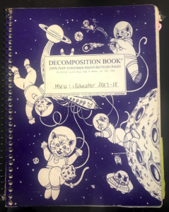
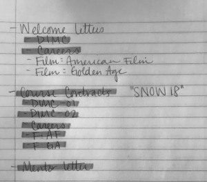
While I love the gadgety-ness of teaching online, I still can’t resist writing out my lists. I can’t give up the satisfying feeling of ticking off the items with a highlighter and filling a whole page with completed tasks. As such, my work notebook (complete with a cover of space-exploring cats) is filling up with notes to myself on how to improve the way I convey my expectations and instructions to students in the future.


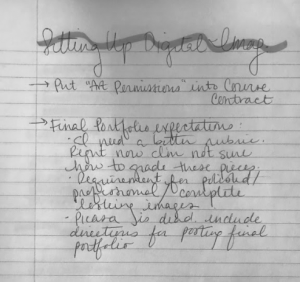
Some of the things I’ve been thinking about are how I communicate my expectations in Digital Imaging–grading art is always subjective and tricky, and it’s so important that the student knows what you’re looking for. I want to stress, this coming semester, that as the course progresses one thing I’m looking for is a polished, finished, and professional looking image.

But I also know that even that isn’t very clear. What makes something polished?

I’ve begun compiling examples of student work, examples I’ve created, and (the most fun) youtube tutorials.

While this semester I shared youtube tutorials weekly as a sort of inspiration/jumping-off point for portfolio work, I want to use them next semester to challenge the student and force them to think about what makes that image look “finished.” I also want to stress the importance of “visual research” in art practice: for example, in our  magazine mock cover project, about 40% of students turn in a square or landscape oriented image. I have an oft-used comment in my feedback repository asking them to imagine a physical magazine in this shape: is it easy to read? is it easy to mail? is it recognizably a magazine?

I want to bridge these gaps by communicating better with students about the artistic process. After all, I know that the first step in creating a mock magazine cover should be to google image magazine covers–I may think I know what they look like, but until I’ve looked at them critically, I’ll never be able to make one that looks convincing. I need to communicate that process with students, rather than assuming that they’ll go through those currently unspoken steps.

Another area I’ve been working on communicating these expectations is in improving and overhauling my welcome letter–moving it from a static pdf file to a Google Slide that includes links, gifs, and a full page of in-depth instructions for completing that pesky course contract that had so many students hung up this semester.

My teaching style and the way I communicate with students has historically been to be frank and honest. I want them to know that we’re on the same team, and we’re working together. I value open and honest communication very highly, and I know that the easiest way for a teacher to alienate me was by speaking down to me, so I work hard never to do that.

It’s a little harder for me to implement that in the online context, because I’m also chronically long-winded, and I’m afraid that students will stop reading or watching anything I post after a certain length–unlike face to face, where they have to just sit through it. In a video I recently made, my first attempt was 6 minutes: I tried to cut it down to 3, and ended up recording a second attempt that went over 7 minutes.

This is something I’m continuing to work on. I want to be open with my students and explain the reasoning behind my expectations: if I can’t, then it must not be a great expectation. I feel that if they understand why they should do something, they’ll have the knowledge to do it to the best of their ability–and the context to do it in a creative and original way that I haven’t even thought of.

I know that I’m a work in progress, as is the way I communicate with students–but I’m excited for a new semester where I implement what I’ve learned, and where I learn more to put towards the future.

Inspiration

Last week’s webinar topic (Instructor Showcase) was such a great learning opportunity: I loved seeing what my colleagues are doing in their courses and sharing tools and resources.

I love that through these tools, we can teach the same subjects and the same courses, but remain unique and provide our own version of an awesome experience for students by creating a genuine connection that grows from who we are. Each instructor’s persona was so unique and accurate to how I’ve been growing to know them–it was wonderful to see that reflected in the way they design their classrooms.

It’s so vital that we find ways to show students that we’re not a computer program that spits out grades–just like in a face to face context, building relationships with students is an important (and rewarding) part of the education process. By sharing some of ourselves, we encourage students to share some of themselves in return, and we’re able to forge connections and relationships.

What’s more, I’ve seen through my focus on engagement that students seem to be paying more attention to my announcements–which is a relief, because I do actually have some vital information in them. I get a little sigh of relief from each student that acknowledges the things I share in the announcements.

While there are areas that I’ve grown so much in this semester when it comes to announcements, I’m still very new at this, and being able to see what my colleagues are doing gave me so many ideas for how to improve my own classroom.

For example, some of the instructors who shared have been so successful in padlet: I used my first one just last week, and didn’t get a single post. It was a little disheartening.

It got me thinking about the importance of a classroom routine, and establishing it from the get-go. I had to swallow that failure, but it’s had me thinking about how to incorporate sharing of that nature in all my classes from day one at the new semester. While I’ve been successful in getting my Art Appreciation and Digital Imaging kids to share, I think the discussions would be a lot more robust if it were a familiar process from day one.

I also loved seeing how other instructors are using digital tools to help teach their content. Animoto, for example, is one tool I’ve never used, but I can imagine it being very useful to explain certain art and compositional concepts. Many of the things my colleagues shared left me feeling inspired and energized.

I left the instructor showcase webinar with a lot of ideas and a new to do list–I’m excited to plan and create my courses for the next semester, and to find ways to continue to grow in my classroom.


Skip to toolbar